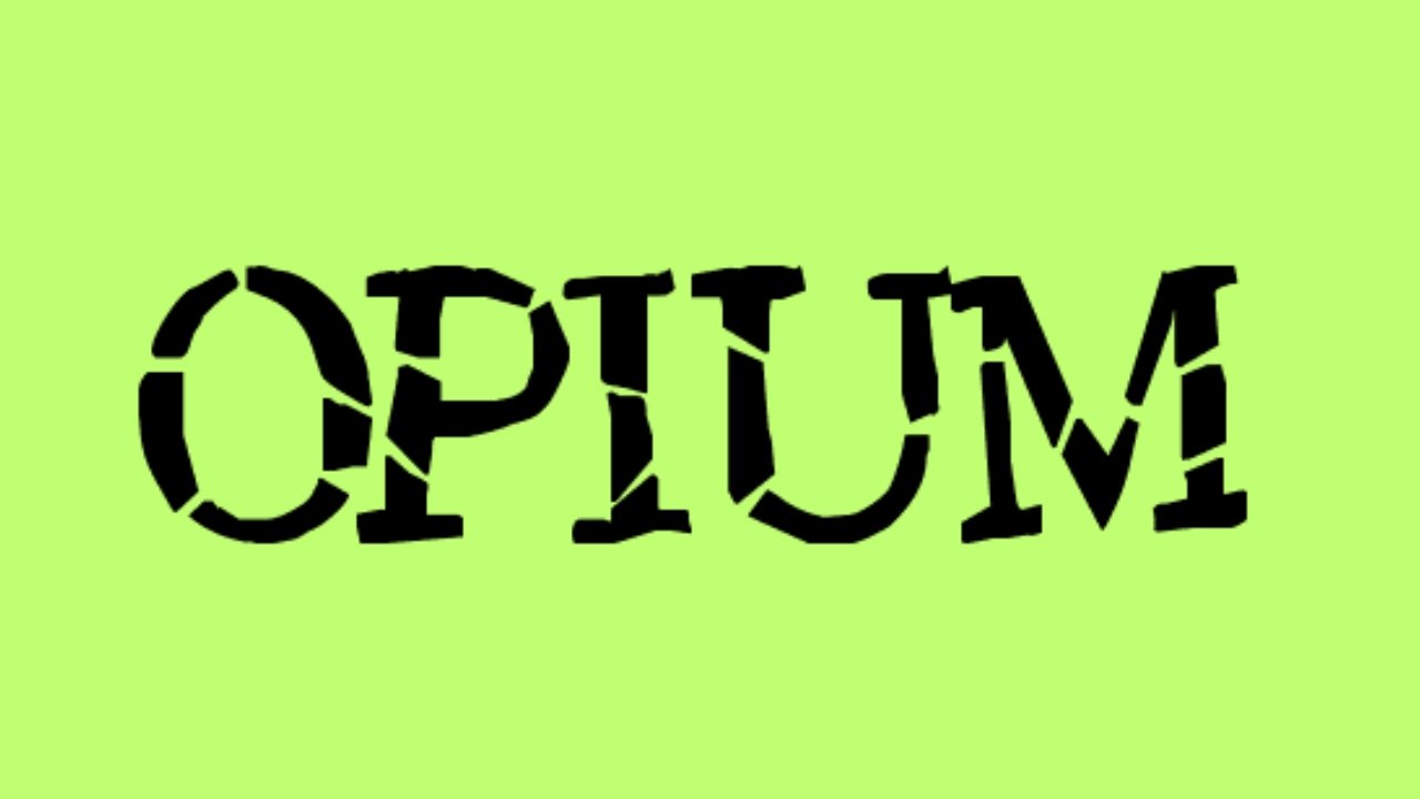
Typography is more than just letters on a screen—it’s an art form, a mood-setter, and often, the emotional core of visual storytelling. Among the many fonts capturing attention in today’s digital design space, the Opium font has carved out a unique niche. Sleek, seductive, and effortlessly modern, Opium isn’t just a typeface—it’s a vibe.
From minimalist branding projects to high-end fashion magazines, the Opium font has emerged as a go-to choice for designers aiming to evoke sophistication with an edge. Its allure lies not only in its visual charm but also in its adaptability across various design contexts, from editorial layouts to logo designs. For American creatives, the Opium font is fast becoming a new standard in artistic font expression.
In this blog, we’ll dive deep into the characteristics, origins, use cases, and creative value of the Opium font—offering insights on why it stands out in the ever-expanding world of typography.
The Origins and Aesthetic Philosophy of the Opium Font
Understanding a font’s backstory is key to appreciating its impact. The Opium font, developed in recent years as part of a broader trend toward minimalistic elegance, draws influence from Art Deco geometry fused with modern sans-serif smoothness. Its elongated forms, thin serifs, and ample spacing combine to create a look that feels both timeless and innovative.
Often described as a “fashion-forward” typeface, Opium encapsulates a sense of curated luxury. Much like the scent of its namesake, the font carries a mysterious, almost sensual quality, commanding attention without being loud. It fits seamlessly into brand identities that aim to exude a high-end, exclusive feel—perfect for luxury fashion houses, perfume lines, upscale editorials, and creative portfolios.
What makes Opium different is its ability to be both contemporary and classic. The subtle flares and high contrast strokes are not just stylistic; they guide the reader’s eye, introduce rhythm into the page, and elevate even the most mundane content.
Opium Font in Practice: Where Form Meets Function
As elegant as it appears, the Opium font isn’t merely decorative—it’s also highly functional. Designers across the U.S. and beyond are using it in brand identities, website headers, editorial spreads, and packaging. Its sharp readability at larger sizes makes it ideal for impactful headlines, while its delicate forms prevent it from becoming overbearing.
In branding, Opium font performs remarkably well for companies that want to signal exclusivity. When paired with monochromatic or minimalist design themes, it reinforces a brand’s upscale positioning. On the web, it enhances user experience by creating strong visual hierarchy—without distracting from the core content.
In digital advertising and social media creatives, Opium adds flair and class, particularly for industries like luxury retail, cosmetics, jewelry, and design agencies. It has even found a home in UX/UI design mockups, where mood and tone need to be conveyed quickly through visual cues.
According to Dr. Jennifer Roberts, a typographic researcher at Columbia University, “Fonts like Opium are not just aesthetic choices. They signal intent, identity, and emotion. When brands choose Opium, they are often communicating subtle messages of sophistication and modernism.”
The Technical Side: Anatomy and Design Details
To truly grasp the elegance of the Opium font, a closer look at its technical structure is essential. Its letterforms feature high contrast between thick and thin strokes, reminiscent of transitional serif fonts like Baskerville, but with a cleaner, more modern finish. The spacing is generous, allowing for breathability in compositions and enhancing legibility.
Unlike some ornamental typefaces, Opium balances flair with clarity. The ascenders are long and elegant, while the bowls and counters are distinctively shaped to enhance aesthetic flow. The lowercase letters maintain consistency, while the uppercase letters stand out with dramatic flair, often used to make logos or headline elements feel more dynamic.
Moreover, many Opium font packages come with stylistic alternates and ligatures, giving designers flexibility to customize the feel further without switching typefaces. These OpenType features are especially valuable for branding and editorial use, where typographic expression must align with tone and voice.
Why Designers Love the Opium Font
The appeal of the Opium font goes beyond its visual appeal—it’s about what it represents. In a design world increasingly saturated with generic sans-serifs and overly ornate scripts, Opium offers a refreshing middle ground. It’s both bold and understated, modern yet timeless, expressive without being overwhelming.
Designers appreciate its versatility. Whether it’s applied to the masthead of a high-end fashion magazine, the logo of a boutique design studio, or the homepage of an eCommerce store, Opium rises to the occasion. It adapts to various brand stories while maintaining its own visual integrity.
Additionally, the Opium font fits neatly into current trends—like brutalist minimalism, serif revivalism, and editorial maximalism—making it a safe yet stylish choice for contemporary creators. It plays well with both bold color palettes and muted tones, sharp photography and soft illustrations.
This duality is what makes it exceptional. The same typeface that enhances a modern wedding invitation can just as effectively elevate a cutting-edge app UI. It’s this ability to shape-shift across design ecosystems that gives Opium its staying power.
Licensing and Where to Get the Opium Font
Opium font, like many high-quality typefaces, is available through professional font foundries and design marketplaces such as Creative Market, MyFonts, and Envato Elements. It’s typically released under a commercial license, so designers should ensure proper usage rights depending on the intended application—be it digital, print, or commercial branding.
When investing in the Opium font, it’s important to consider the weight options (light, regular, bold), available glyphs, and multilingual support. Most reputable distributors provide extensive previews and test tools so users can visualize how the font will look in different contexts before purchasing.
Some variations or similarly styled fonts may be available under free licenses, but authenticity and quality may vary. For professional projects, opting for the original Opium font package ensures access to full features and optimal rendering.
SEO Meets Aesthetics: Opium Font’s Role in Digital Branding
In the age of digital-first branding, every element of a website—including typography—contributes to SEO and user experience. While Google’s algorithms don’t “read” fonts per se, user behavior driven by design aesthetics does influence metrics like bounce rate, time on site, and conversion rates.
Using fonts like Opium can create a distinct visual identity that keeps users engaged. In particular, brands that want to stand out in crowded markets can benefit from the subtle psychological cues conveyed by such refined typography. Opium font enhances readability and emotional tone, both crucial for storytelling and content engagement.
Additionally, consistent use of a typeface across digital platforms—including landing pages, social media posts, and emails—reinforces brand identity, which contributes indirectly to SEO through increased user trust and interaction.
Conclusion: Is the Opium Font Right for Your Brand?
Typography plays a pivotal role in shaping user perception, and the Opium font has become a hallmark of modern, elegant, and emotionally resonant design. Whether you’re building a brand from the ground up or refreshing your current aesthetic, Opium offers a sophisticated tool to elevate your message.
Its blend of luxury, minimalism, and adaptability makes it suitable for a wide array of applications—from high-end fashion branding to editorial publications and beyond. However, as with any design choice, the key is intention. Choose Opium not just for its beauty, but for how well it aligns with your brand’s voice, audience, and story.
As design trends continue to evolve, one thing remains constant: typography matters. And in that realm, Opium is more than just a font—it’s a statement.


